
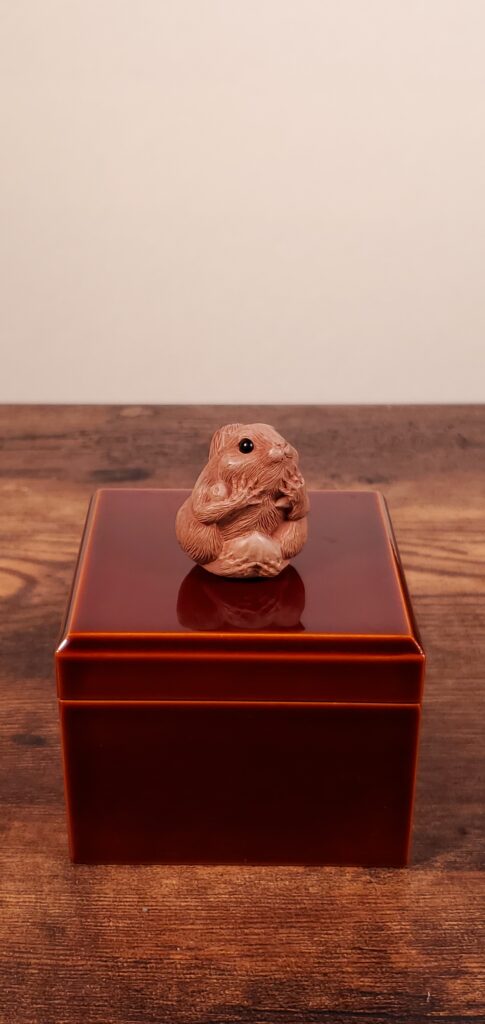
Risu, a signed Showa-period netsuke carved in wood by Adachi Kouji, offers a starting point for thinking about miniature scale. On compact objects, detail has to stay readable at hand distance. The same constraint shapes lacquer decoration on an inro, where layers, outlines and open space must fit a small case.
An inro is a small multi-tier case. The lacquer, urushi, is built up in thin coats, and each coat is left to cure before the next goes on. Successive coats build the surface on which decoration is placed. On a large tray or cabinet, a broad area gives a design room to spread, with space between its outlines and smaller details.
On an inro, the same work takes place across faces that a hand can cover. The ground, the decoration and any coats above it must produce a readable design within that small area. The thickness of a line matters in relation to the motif it describes. Reduce an outline too far and it becomes difficult to distinguish; leave it too broad and it can obscure the spaces within the motif.
Maki-e, in which gold or silver powder is sprinkled onto wet lacquer to form a design, makes this relationship especially clear. The size of the powder grains affects how an edge appears. Coarser grains can give a broad area a visibly granular texture. Along a tiny motif, that texture may make the outline look stippled, so the size of the grains needs to be considered alongside the size of the design.
Look at the boundary between the metal decoration and its lacquer ground. A small shape needs enough separation from its surroundings to remain recognisable. The detail within it also needs space: a clearly defined outer edge can enclose marks that become difficult to distinguish when crowded together.
An inro offers a front, a back, sides and narrow bands where the tiers meet. These surfaces leave little room for a motif and its surrounding ground. Simplifying a silhouette can help it survive the reduction in scale. Interior detail may be concentrated into a few strokes or dots of gold, making their spacing especially important.
Many inro carry a design across the seams between tiers, so that the closed case presents a continuous picture. Opening the case separates that picture into parts. The decoration therefore has to be considered both across the assembled case and on its individual sections. A line crossing a join makes the relationship easy to see: follow where it ends on one tier and resumes on the next.
Pacing also means deciding where to leave the lacquer ground undecorated. A dense area beside a sparse one gives small details room to remain distinct. Plain lacquer around a motif separates it from the edge of the case and from neighbouring decoration. Compare two inro and you can often see the difference at once: one fills each face to its border, while another lets a single motif occupy an open field.
Both arrangements pose questions of scale. In a densely decorated face, check whether the gaps between elements remain visible. In an open composition, compare the size of the motif with the space around it. Those proportions determine how readily the design can be read across a small surface.
The practical test for miniature lacquer is to view the case at the distance you would normally hold a small object. Check how the width of each line compares with the size of the motif it outlines. Look at whether the metal powder forms a smooth edge or a broken one. Where handling is permitted, tilt the case slowly and watch what happens as light crosses the surface.
Tilting matters because high-gloss lacquer reflects its surroundings. Reflections can compete with small decoration for attention, changing which lines and spaces are easy to see. Watch whether the silhouette remains recognisable as the reflected light moves. This gives you another way to assess the size of the elements and the spacing between them.
Then compare what you can distinguish at an ordinary viewing distance with what becomes visible closer up. The larger shapes establish the composition, while finer marks supply detail as you approach. A small case can accommodate both, provided the marks have enough definition and separation to be read at their intended scale.
On the next inro you see, follow the decoration across the narrow bands where the tiers meet. Which elements remain clear across the joins, and where does open lacquer help you distinguish them?
Contact us at giulio.dirienzo@gallerymitsuido.com or visit us at 3 Chome-1 Kamiokamotomachi, Takayama, Gifu 506-0055, Japan.